The Reports module in Exsited provides a suite of interactive dashboards that help users monitor key business metrics across purchasing, invoicing, quoting, account creation, and payment activity. Each report includes visual trends, drill-down capabilities, and flexible filters—allowing teams to track performance, identify anomalies, and support data-driven decisions across procurement, finance, and sales functions.
More > Report
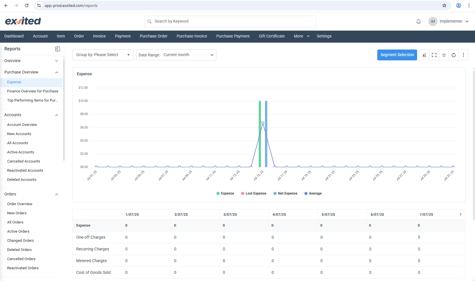
Expense Overview (Purchase Overview > Expense)
What you see
Why it matters
How to use it
Line / bar chart plotting four metrics – Expense (green), Lost Expense (pink), Net Expense (blue) and the Average(Purple) line. A spike on 15 Jul shows a one-off cost event.
Consolidates every posted supplier bill, return and credit for the selected period so finance can compare “gross” vs “net” spend and spot leakage (Lost Expense).
Pick a Date Range (defaults to Current month). 2. Optionally Group by supplier, item group, or location to break the curve into multiple series. 3. Use Segment Selection to filter by a saved segment such as “Top 10 suppliers”.
Typical use-cases
Verify month-to-date purchasing costs before closing the books.
Identify sudden jumps in Lost Expense (e.g., returns, write-offs).
Track the effectiveness of cost-saving initiatives – Net Expense should shrink over time.
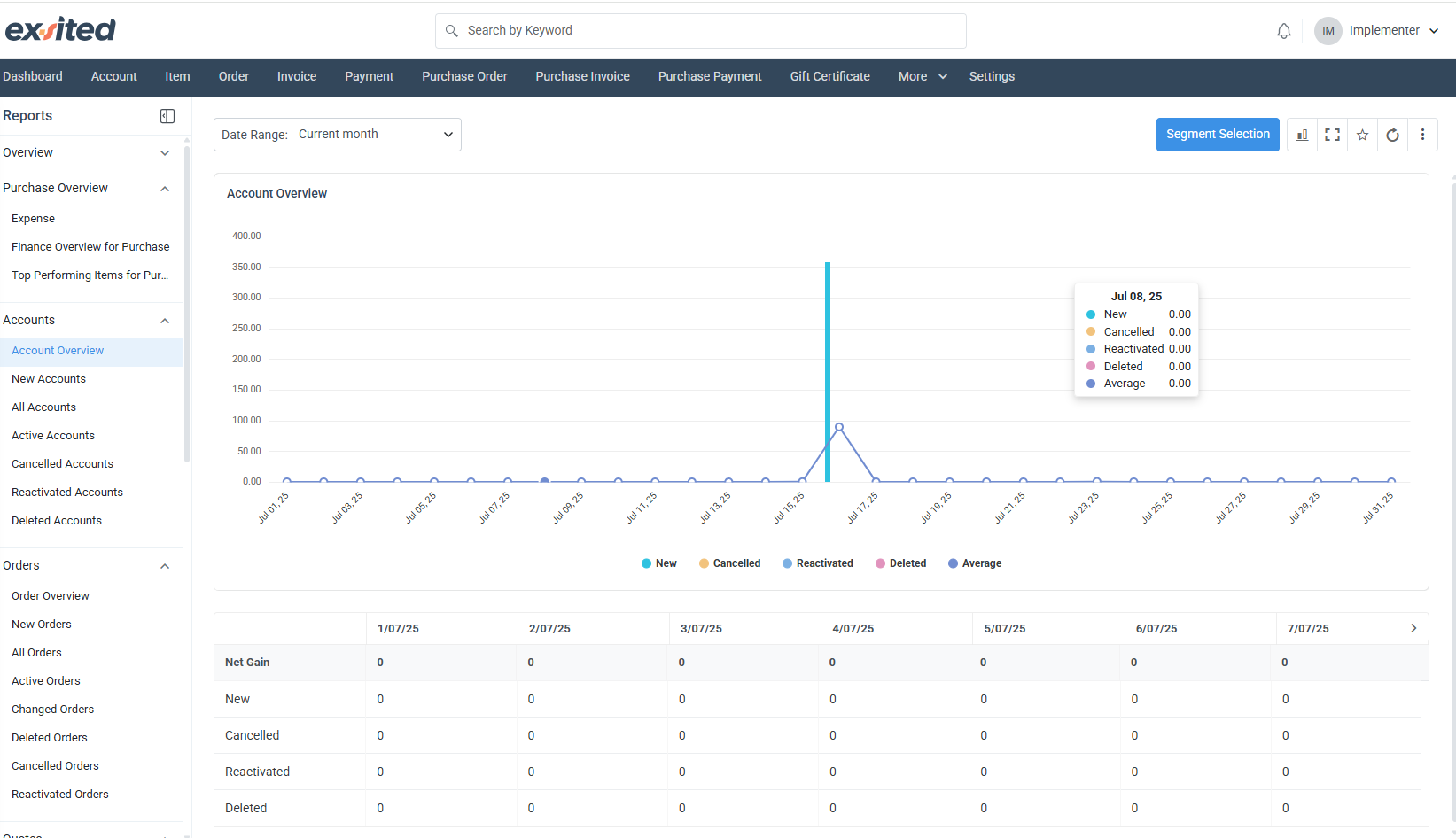
Account Overview (Accounts > Account Overview)
What you see
Why it matters
How to use it
A single-series chart showing counts of New, Cancelled, Reactivated, and Deleted accounts per day. In the sample, a spike of 90 new accounts was recorded on 16 Jul.
Provides a health check of your customer/vendor master data – useful for compliance and data-hygiene audits.
Set the Date Range (month, quarter, custom). 2. Click any metric in the legend to toggle it on/off and isolate trends (e.g., only cancellations).
Typical use-cases
Monitor onboarding velocity after a marketing campaign – New accounts should jump.
Detect abnormal surges in deletions that could point to integration errors or bulk data-maintenance jobs gone wrong.
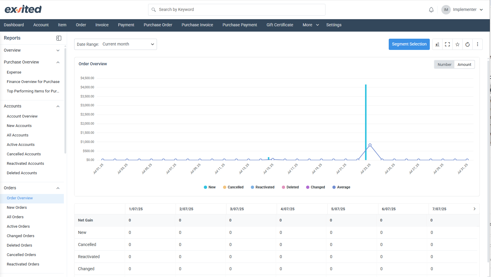
Order Overview (Orders > Order Overview)
Element
Detail
Number / Amount toggle
Switches the y-axis from order count to order value so ops and finance can view volume and revenue with one click.
Status buckets
New, Cancelled, Reactivated, Deleted, Changed, Average – colored series let you see if operational churn (changes, cancellations) is rising.
Date drill-down
However, any data point opens a tooltip with exact figures and a quick link to the underlying order list.
Insights you can extract
Compare the Average line to New orders to understand seasonality.
High counts of Changed orders may highlight upstream data-quality issues (e.g., pricing errors).
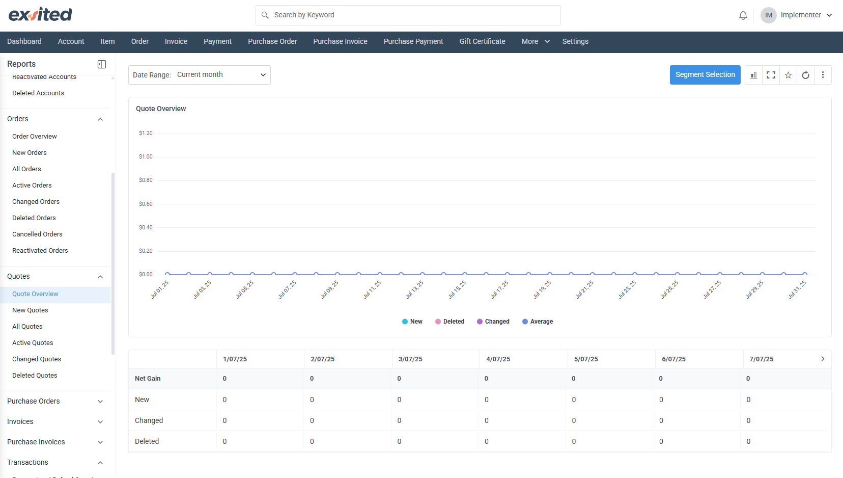
Quote Overview (Quotes > Quote Overview)
This panel tracks the quotation pipeline – from initial quote creation to deletion or revision.
Metrics: New, Deleted, Changed, Average.
Business value: Sales managers can correlate spikes in new quotes with campaign launches, while product teams monitor changes in quotes to understand frequent scope or price negotiations.
Tip: Filter by New Quotes in the sidebar, then open Segment Selection to analyse performance by sales rep or region.
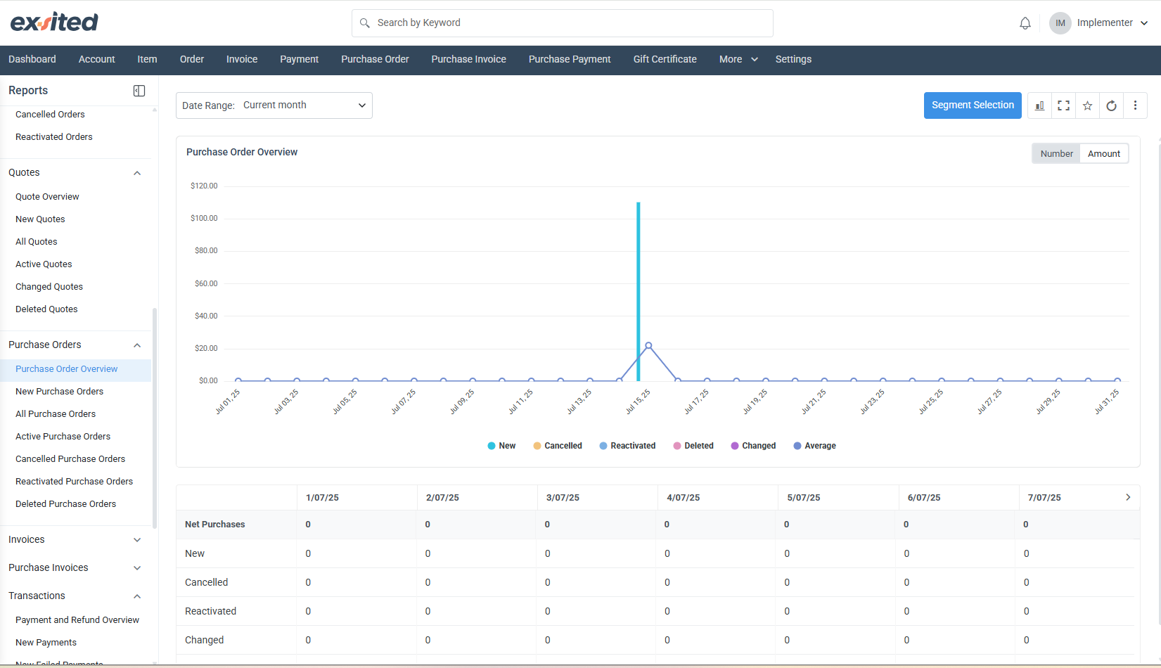
Purchase Order Overview (Purchase Orders > Purchase Order Overview)
Feature
Benefit
Number / Amount switch
Let's toggle between operational workload (PO count) and financial exposure (PO value) in procurement.
Lifecycle statuses
New, Cancelled, Reactivated, Deleted, Changed – instant visibility on supplier reliability and internal change rates.
Spike analysis
A tall bar on 15 Jul indicates a bulk PO import or a seasonal replenishment run; validate against MRP schedules.
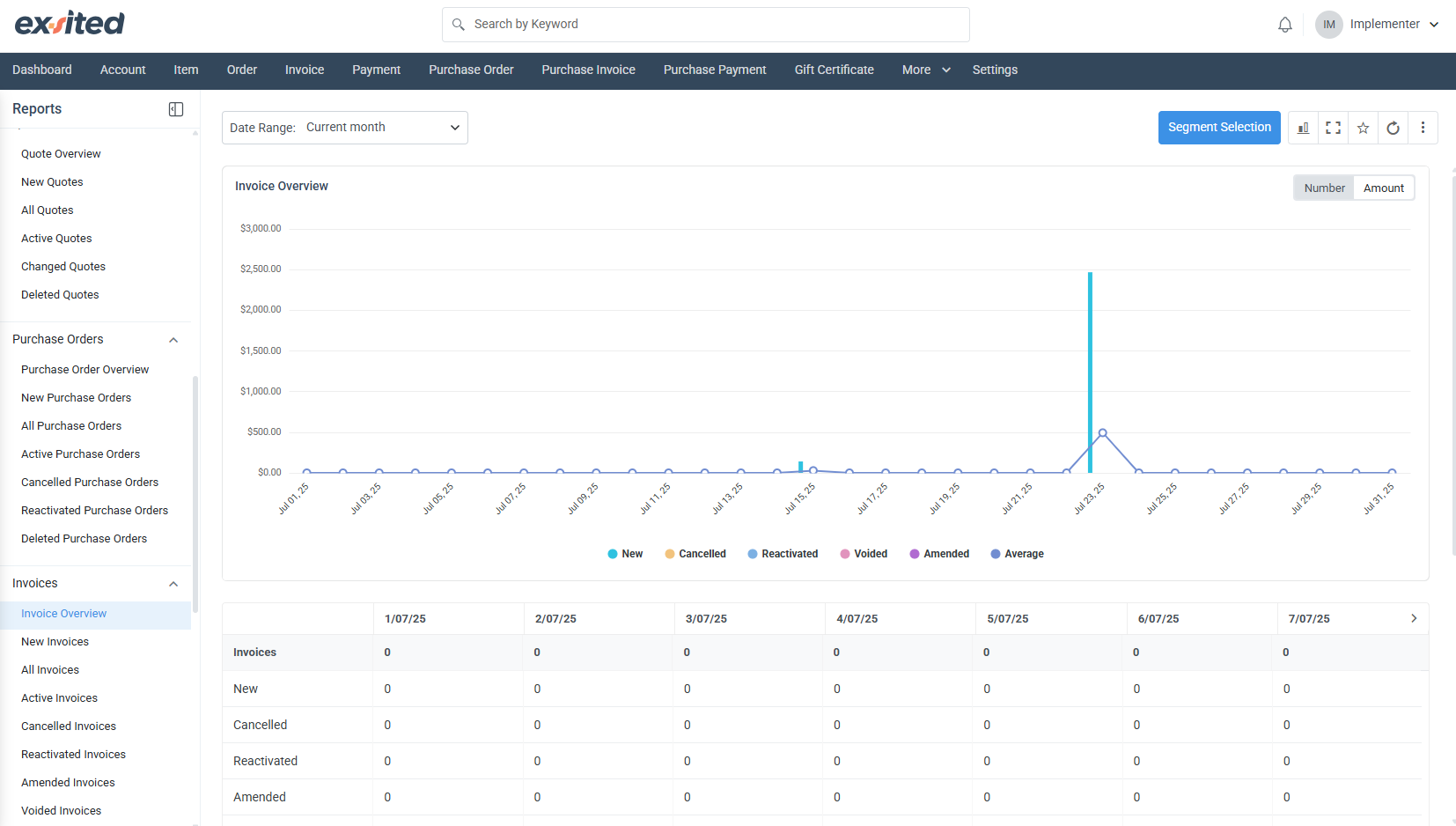
Invoice Overview (Invoices > Invoice Overview)
Purpose: Tracks the full billing lifecycle—New, Cancelled, Reactivated, Voided, Amended, Average—so finance can ensure invoices move cleanly from draft to paid status without re-work.
Quick audit: Toggle to Amount view to check if voided/amended totals exceed thresholds set in your internal controls policy.
Pro-tip: Mark high-value invoices as favourites via the ⭐ icon for one-click access later.
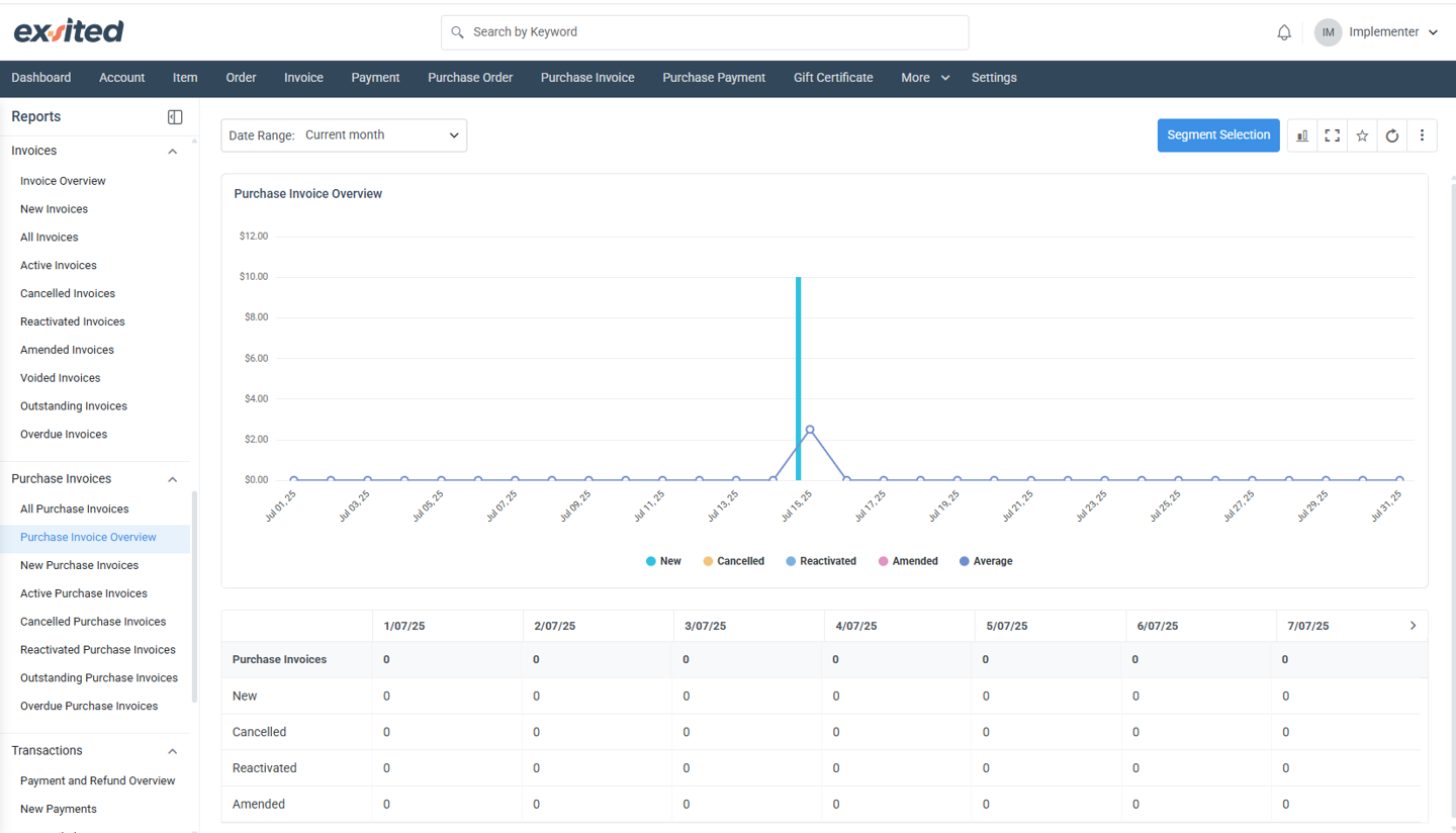
Focuses on supplier bills rather than customer invoices.
Group by dropdown allows aggregation by supplier, item category, or warehouse for spend-by-category analysis.
Key metrics: New, Cancelled, Reactivated, Amended, Average – use Amended spikes to pinpoint data-entry errors coming from OCR or EDI feeds.
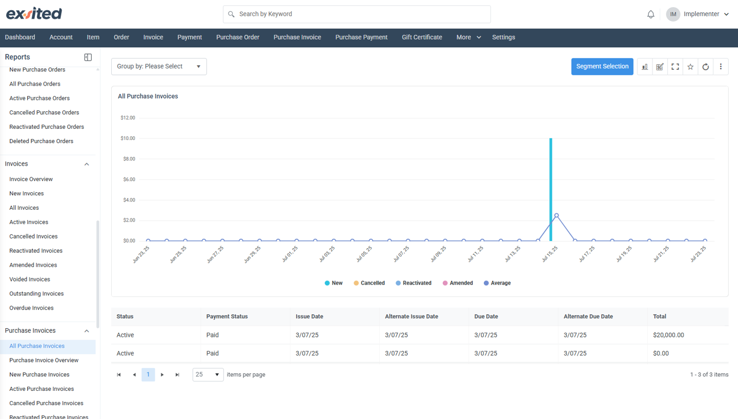
All Purchase Invoices (Transactions > All Purchase Invoices)
Although visually similar to the Purchase Invoice Overview, this report sits inside Transactions and adds a transactional lens:
Column
Explanation
Event timestamp
Shows the exact moment an invoice hit the ledger, useful for real-time monitoring dashboards.
Cross-module links
Click any bar to open the corresponding purchase invoice, credit note, and linked payment on a single screen.
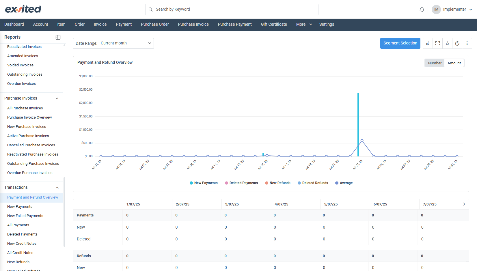
All Purchase Payments (Transactions > All Purchase Payments)
Metric
Meaning
New Payments
Confirmed disbursements posted to suppliers.
Deleted Payments
Payments reversed by finance due to duplication or error.
New Refunds / Deleted Refunds
Tracks money coming back from suppliers and any subsequent reversals.
Average
Rolling daily average of combined payment and refund activity.
Why it matters
Finance can instantly spot a surge in refunds that might reflect shipment discrepancies or pricing disputes.
When paired with bank-feed reconciliation rules, this chart validates that all outbound payments are captured in Exsited.
Common Navigation & Controls (applies to every overview)
Segment Selection (blue button): Opens a dialogue to filter the chart by any saved segment—perfect for ad-hoc “show me only high-value suppliers” queries.
Date Range picker: Supports “Today”, “Current week”, “Current month”, custom periods, and relative ranges such as “Last 30 days”.
Chart toolbar (icons on the right):
Swap between line and column view
Full-screen mode for presentations
Add to personal Favourite list
Hard-refresh to pull the latest transactional data
Best-practice tips for analysts
Save time-boxed segments (e.g., “FY25 Q1”) to avoid manually resetting filters every session.
Build Confluence page macros that embed each overview with context-specific commentary—use the permalink from the menu so the chart auto-refreshes.
Combine the Expense, Purchase Order, and Purchase Payment overviews in a single Confluence dashboard to visualise the entire procure-to-pay cycle at a glance.